According to the latest study by MicroStrategy, data analytics for business pack so much untapped potential that 65% of world-leading brands are doubling down on it in terms of spending for the next year. The figures show a 64% productivity climb, increased financial efficiency by 51% and improved/streamlined decision making by 56%. It is used to reveal new sources of revenue by 46% of companies, and 45% are using the insights review and improve the existing working models.
The best way to achieve this is to visualize the data on multiple interactive pages that will allow you to see the year’s results under a different angle. Are your report forms fit for the job?
Reports ≠ Analytics
Annual reports. Stakeholders need them, those who do them – hate them. Those who had seen a few in their lifetime know that things can easily veer off into a mess. An entire year of data is indeed a lot to process and organizing it into something decent can pose a major challenge.
Today, data is a multitude of complex signals flowing in from different sources across the entire company, and those who need to process this information can literally feel bombarded. In its survey BlackLine established that 40% of respondents took little confidence in this information due to the volume of contradictory data only made worse by the prevalence of human errors.
It is estimated that around 10% of all business actions contain some pesky errors. The main reason is the inconvenient workflows. The person often has to scroll through large datasets and navigate multiple windows. Even with two screens to match all the data, you still lose a lot of context. Add to that the mood of December festivities distracting people and you get a perfect recipe for disaster.
Would that bring you an insight worth thousands of dollars?
Valuable Data from Spatial BI
Even without the excuse of any celebratory reason, the analyst team is usually stretched, and so the important reports don’t arrive on time. The main problem is lack of automation. Large volumes of data need to be double-checked and revisited manually.
Visualization also leaves much room for improvement. When there are 300 pages to read – the charts and graphs do make it in episodically to clear things up. For digital products and services they can suffice, but for businesses that have to do with physical inventory and real places – location-based analytics are essential. You can observe a lot when you put different phenomenons on the map and see how they cover the area.
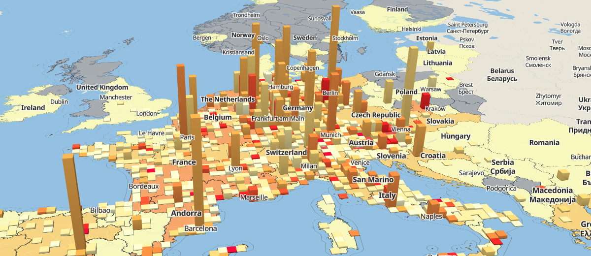
To really show what data visualisation tools can do for you we’ve the following demonstration map for a delivery network. A multinational retailer with branches all across Europe, the company has to work with a highly segmented patchwork of countries and regions, each having its own set of nuances in terms of supply, demand and local competition. On the interactive visualization, you can see many things that would otherwise have been lost in the writing.
Benefits of Spatial Analysis of Business Data
Among the multiple layers, the most important thing you can see is transaction volume. For the viewer’s convenience, it is shown via two layers. The first displays the volume of deliveries for each administrative area within the country, which translates as levels of color strength, ranging from the most active to the inactive regions (in faint and vibrant hues of green). The second one shows the cost partition per region. The comparative percentage of delivery cost is highlighted from yellow to saturated red (obviously, critically high) by the amount.
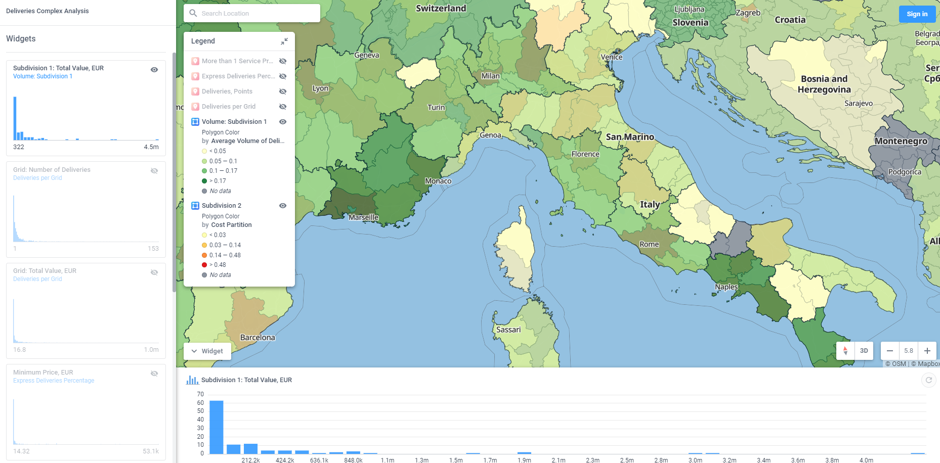
The exact delivery locations can reveal important patterns as well. They are the scattered blue dots over the continent map. Through them you can see the regions with no transactions (e.g. UK).

To get more perspective on the amount of deliveries per region, we’ve prepared a 3D layer with height columns that really answer the question of how many low-cost and high-cost deliveries took place in a region of interest?

On the very top, we have two dot layers that can be toggled separately. One displaying the number of competitors per region and the second showing the number of express deliveries. Whether you plan to cut expenses moving from express to regular delivery, or going to expand express delivery to push out the competitors – you’d see how to act in each particular region.


Make sure to check other data visualisation examples we’ve prepared by visiting our collection.
Summary
A picture is worth a thousand words. As you can see, in cases where location matters, powering your data with geographical insights is the difference between a good report and a boring novel. The information keeps getting more complex, and so the means to keep it understandable need to become more advanced.
The sheer volumes of data are a bottleneck for manual processing too. This is a huge matter when you need the stats to guide an important decision. For this reason, we’ve included the automated update feature into our framework. It allows you to schedule a query that will fetch the required data within Aspectum. The platform will add it straight into the needed layer on its own.
As a result, you always have a fresh map analysis at your disposal with no need to outsource a specialist to look for errors. Now you are sure that the region that had shown profitability had gotten an accurate estimate and your analysts don’t need to go through the repetitive motions of rounding up the past figures. Instead, they can focus on actually improving your business.
Show Me What Can I Do with My 2019 Business Year Analysis!
With data visualisation tools, business intelligence can help to automate the manual analysis, easily find patterns, reduce the expenses and makes for a vivid display at a stakeholder meeting.
As for transitions, Aspectum is easily integrated into your BI framework of choice. It doesn’t require any sophisticated product to merge with and so even if you keep your information in good old spreadsheets it won’t become an issue.
Delivery and supply chain management are not the only department where spatial business intelligence is highly effective. Contact our business support specialists to see what you can do with your specific 2019 business year topological data analysis via Aspectum.