How to Make Your Own Map with Visualized Insights Based on the National Income Statistics in Barcelona
World map datasets are the future of visual insights that still has a long way to go before it’s fully adopted. How exactly does it work and what makes it so good? These are the questions we cover in the following piece that is based on the public record of median income of citizens in various regions of Barcelona.
Choosing a location for your next shop or office is a lot of work. More often than not the infrastructure is too difficult to discern all the right openings to grow your business. These can be the availability of properties for rent or gathering areas for your potential clients.
Creating GIS Visual dataset for your map
One of the most simple and evident metrics to segment your target audience — is the financial capability of the population. In this example you can see the data on income levels for one family member in Barcelona.
To make your own map online via Aspectum, register a free account or login if you already have one. First things first, we have to upload the dataset. Aspectum supports the following file formats:
- CSV, XLS, XLSX;
- GeoJSON;
- ESRI shapefile (all files have to be in ZIP archive);
- KML.
Go to DATASETS tab to proceed with the upload. Press the Upload Datasets button or simply drag and drop your file into the browser.

The green check mark in the lower left corner of the dataset confirms the successful file upload.
With it we can now create a map. To do this we right click the dataset and choose Create map. Afterwards we enter the name of our future map:

In the output we get a map of Barcelona with marked regions containing attributive data that describes them.

However, this map is not very informative and it won’t be an asset for any relevant decision making. The regions have to be grouped in lines with specific common features. For instance, segment them into classes by the levels of income. The correct term in our case is to stylize the map.
By clicking the layer with city districts in the Layers menu — we get into its settings menu.
Then go to Style tab. The following menu adjusts the visual attributes of the layer — its transparency, color, outline and more. This is where stylization takes place.
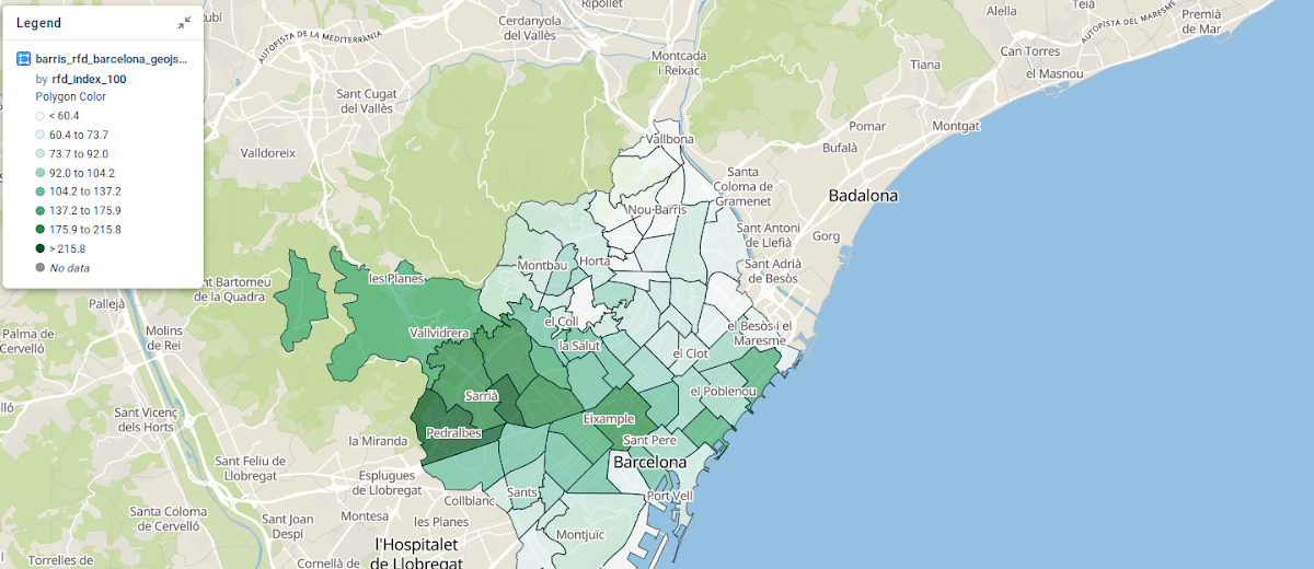
On the left side click rfd_index_100 near Column displaying the income level per one family member. As a result we get a stylized map of Barcelona with income levels of different districts that are divided by classes.

The Classes menu allows us to choose the color pallet for visualization and the number of classes to partition the regions.
When entering new markets, more often than not we’ve already established an approximate targeted consumer profile and their level of income. A stylization of this type can highlight all the city districts that fit our requirements and evaluate their relative position.
Making your map Distinct
Next is the visual design of the project.
In this particular case you may confuse the style pallet with vegetated areas and forests on the default basemap. Let’s change this. In the lower right corner click Basemap, and choose the layer called Light.

Commonly, the object attributes contain a lot of technical data that doesn’t create any end-user value and clutters the readings that are important. Aspectum allows to adjust the visualization of attributes.
Let’s go to the layer settings and then Infopanel tab, where we can find the complete list of our attributes. Here, we leave only region name and average income per one family member. These are nom and rfd_index_100. To do this we remove the check mark near Select all, and put it only next to these attributes. Also, let’s rename them.

This is the one of the most straightforward ways to create GIS map online and showcase the population income by different districts in Barcelona. In the output we get a stylized map to distinguish the target audience on the regional level. With this particular map we can establish that the distributed income levels are higher in the central and western parts of the city.