Thematic maps, like wheels, are an ancient invention that traveled through millennia to our days. With time they didn’t lose their popularity, on the contrary, the number of areas of their application only increased. Modern maps evolved to the extent that there’s no resemblance left between them and those clay tablets now displayed in museums. Contemporary thematic maps have got it all from aesthetically pleasing looks to compelling ways of displaying spatial information. And as computer technologies became more advanced, maps became even more sophisticated: this time with powerful thematic map visualization that processes and displays geographical information.
However, not only the functionality of thematic maps grew: so did the diversity. Political, statistical, geologic, trajectory, 2D, 3D — you name them, cartographers have got them. And as ways of spatial visualization are numerous, this rich selection may be confusing. Let’s take a look at the top 5 types of thematic maps and how you can best use each of them.
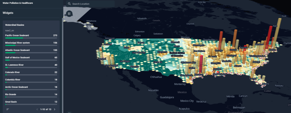
Choropleth Maps
Surely, you’ve seen one of such maps many times. The choropleth map definition explains that it’s a tool where shades and/or patterns are used to distinguish the differences between areas depending on the theme. The foundation for these maps is statistics on administrative districts from verified sources compiled over extended periods of time. In order to create choropleth maps, cartographers and analysts resort to generalizations since the statistics in actual areas not always can be reflected in symbolized regions.
When can you use choropleth maps? When your data comply with three main criteria:
- It is affixed with the regions (countries, provinces, districts, etc).
- It has been patterned for showing ratios and rates.
- It is ongoingly updated from any region of the location mapped.
The main choropleth map advantage is that displaying trends by areas works perfectly with this map. At the same time, revealing solely numbers on it won’t do much good.
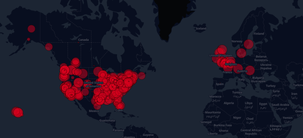
Point Maps
The point map’s definition is contained in its name: they display spatial information as points. One of the main distinctions that make point maps stand out in the cartographic family is optimization for processing extensive volumes of geospatial information.
Here’s a list of examples of what point maps do:
- Present data as circles (aka pulses).
- Scale each point depending on its value.
- Display datapoints chronologically.
- Assemble data by scale or count.
- Color-code datapoints.
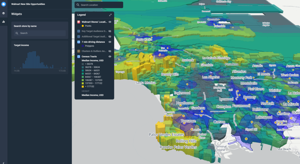
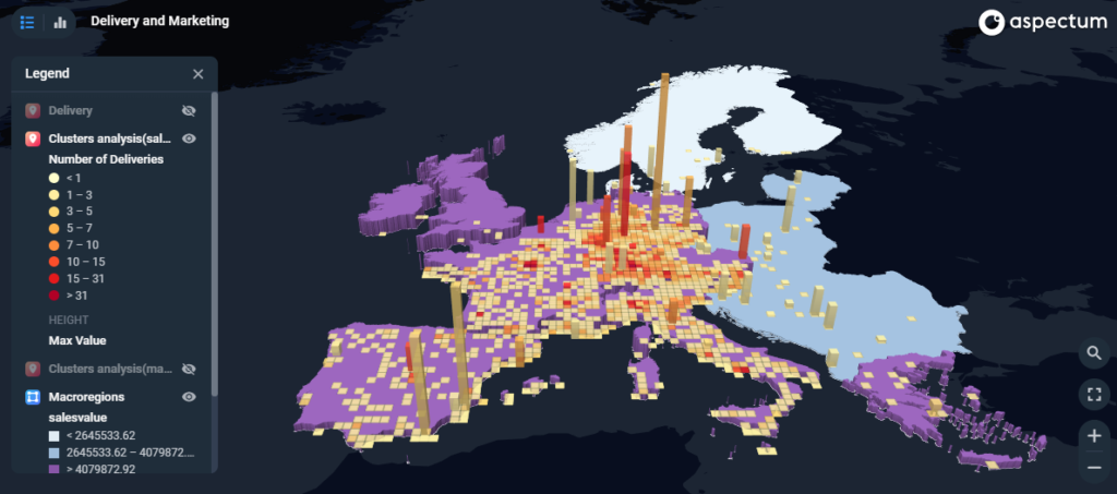
Three-Dimensional Map
We all are used to seeing maps in 2D, and they perform their functions perfectly. But modern-day technology empowers us to create and effectively use the added third dimension. However, current 3D world maps are more than just about 3D images. For instance, when using scenes on such maps, you can adjust light, view angles, zoom levels, and more.
The main strength of three-dimensional maps is displaying the geographical information in 3D preserving the utmost realism. Clearer navigation and integration with displayed reports create an elevated experience for users. Furthermore, not only is the landscape displayed realistically but also users can take measurements for complete geographical analyses.
Pros of Three-Dimensional Maps:
- Vertical information: on this map, users can measure the heights of mountains and buildings, as well as examine surface reliefs.
- Clear symbols: 3D mapping allows using realistic and understandable symbols for identifying spacial objects without consulting the map’s legend.
- More than a bird’s-eye view: users can view landscapes from the most convenient perspective by adjusting viewing angles.
Heat Maps
The definition of this thematic map explains it as a tool that uses colors to help readers differentiate locations by the intensity of displayed phenomena. They present complicated information in a comprehensible way instantly. Therefore, the main advantage of visualizing reports with the help of a heat map lies in its readability. Normally, it takes analysts or business users to explain some complex presentations on other maps. Meanwhile, users with little to none cartographic experience can freely study the data using heat map tools.
This type of maps is especially useful for bringing attention to patterns and trends. The question is: how do heat maps work? The logic behind the heat map design is simple: darker color shades mean higher values and vice versa. Thanks to its simple and effective way of displaying information, heat maps are widely used across industries and projects for revealing the most important changes in heat map samples immediately.
Regional Map
Once again, the name speaks for itself. Such maps display data in correlation with regions that are usually defined by vegetation, wildlife, or weather conditions. The main principle behind creating a world regional map lies in breaking down a location into smaller areas based on a set of natural and artificial criteria.
The art of cartography enhanced by an information technology gives us truly enormous potential to collect, analyze, and display findings. Knowing the main types help data professionals to know which capabilities each of them possesses and which one to use depending on the project, datasets, and desired outcomes. The range is really wide from maps that require specialists deliberately trained to read them to those that can be used by a broad general audience.