GIS Data and How to Present it on Maps
When working with GIS maps, layers, as well as tools, are crucially important, but all their capabilities are in vain without the main constituent: data. Let's examine what GIS data is, how it originates, and how to operate it.
What is GIS data?
GIS data (also referred to as geodatabases) is related to geographic location. It is oftentimes combined with attribute data which offers supplementary information, and together they reveal valuable patterns for organizations. There are two types: vector and raster.
Vector, in turn, includes polygon, lined (arcs) and point data.
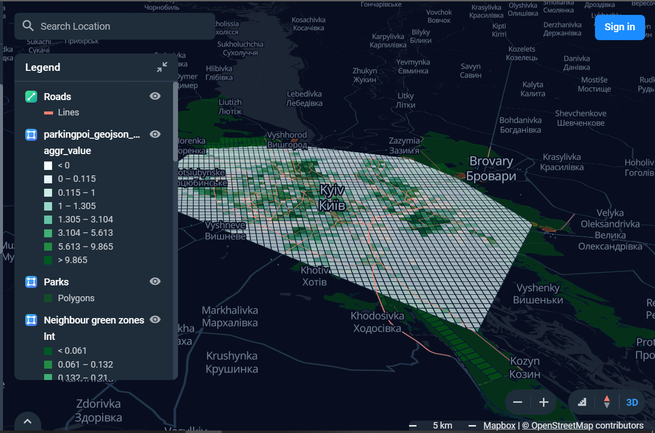
- Polygons can reveal city limits, borders of areas, neighborhoods, forests, etc. It is in 2D, so it can scale areas. These characteristics are usually represented on the map with color schemes, patterns, and sometimes color gradation.
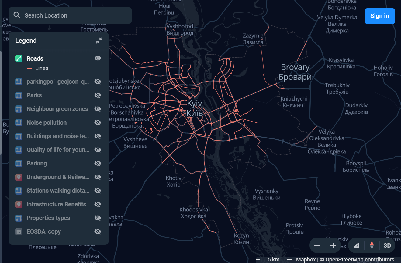
- Lines (arcs) present linear components including rivers, mountain paths, and roads. Since these features are one dimensional and have starting and ending spots, they are used mostly for measuring length.
- Points usually represent discrete data. They have zero dimension, therefore they don’t provide any information about lengths or areas. What these points do reveal are special sites, places of interest, and bridges, to name a few.
Raster (or grid) data illustrate coverings. It is cell-based and combines aerial and satellite pictures. It is either continuous or discrete.
- Continuous represent elevations, temperature, etc.
- Discrete can present demographic knowledge, for instance.

GIS data analysis
First of all, let’s cover such an essential question as “Why do you need the GIS data analysis in the first place?” The answer is to give you a deeper understanding of a situation you find yourself or your business in. Map data visualization studies seemingly different datasets together to create a cohesive picture.
Spatial analysis is a process that helps you look at a certain problem from a geographical perspective. This analysis first begins with computer processing. Then, it investigates and scrutinizes the results.
- Examine the suitability of locations for certain projects.
- Identify patterns.
- Prognose results.
- Monitor changes and their impact.

Data visualization map
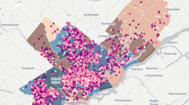
Data visualization is a way of presenting information graphically by using various means, such as charts, graphs, and maps, of course. With GIS map data you can see how clients’ houses are distributed in different locations throughout certain areas (municipality, country, or the country). By utilizing a density map that reveals a retail chain where users can click on the point to receive more data.
- Map markers. With their help, you can reveal markers for different areas. They can be either static image markers or bubble markers.
- Density maps are used to better understand patterns and courses with the help of color gradients depending on the combination of the data.
- Colored two-dimensional map areas represent countries, counties, states, etc. Users can color-code them depending on the value or the significance.
Geodata visualization
The notion “geodata visualization” describes a set of tools and techniques used for interactive presenting data on a map. When creating data map visualization, the location ensures that it is used accurately on the map.
There are two fundamental requirements for the geodata visualization: present the map and demonstrate additional data. The benefit of the interactive map is that unlike a static one with its icons, it offers users an opportunity to manage the map controls and look at the information from different angles.

World map data visualization
When thinking globally, accessing the insights from world GIS data brings ample opportunities. However, representing a 3D world on a 2-dimensional map is no easy task. The main challenge lies in visualizing the world in a realistic way and at the same time, revealing the correlations and patterns important for making business decisions.
- Cylindrical projection is the one cartographers oftentimes resort to. The projection is created by lines (parallels and meridians) crossing at certain angles.
- Conic maps have one big drawback: they are greatly distorted. Their strong suit is that these maps are perfect for visualization on hemispheric or regional maps. The meridians on these maps form cones as they start at one point and then diverge. This starting point lies on a map regardless if there’s a pole or not.
- Azimuthal maps are used for finding direction. These maps have three given points: A, B, and C. The line that connects B and C shows the angles under which someone would have to travel to reach point A.
GIS data allows us to view problems from different perspectives and for different purposes, be it on the local, regional, or global level. This gives a better understanding of what’s happening beyond our reach, what to focus on today and what to anticipate in the future.
To learn more about the GIS data power and it’s potential for your organization, schedule a demo.